
Cherry Wang
Microsoft
As a Design Director at Microsoft’s Developer Division, one of my final contributions was helping to initiate the Visual Studio UI refresh - a full modernisation of a beloved but visually outdated IDE.
This effort was directly driven by the launch of Windows 11, which fully embraced the Fluent Design System, and brought a renewed focus on consistency, accessibility, and visual clarity across Microsoft products.
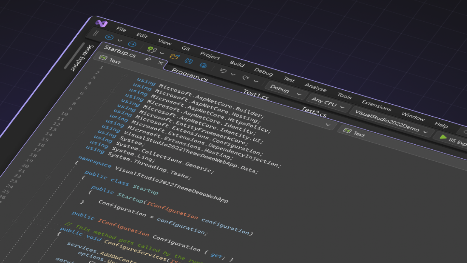
The existing Visual Studio UI hadn’t seen a major visual update since 2012. It was built using a mix of frameworks - WPF, WinForms, XAML, and more - resulting in inconsistent styling, small and crowded controls, and a visual environment that many new developers found noisy and hard to navigate. Our early research highlighted these issues and set the direction for the refresh.
My focus was on establishing a shared design strategy that aligned Visual Studio with Windows 11’s Fluent controls. I worked with designers, UX engineers, and PMs to audit the legacy UI and prioritise areas for change.
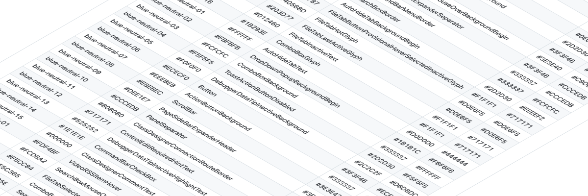
To kick off, we reduced complexity by overhauling the colour system - cutting more than 4,000 tokens down to about 100 - and redesigned key shell controls with a lighter, more intentional style.
After I left for Google, the team continued the work and shipped the refreshed UI as an opt-in preview in Visual Studio 17.2. It included updated toolbars, document tabs, window chrome, and a new set of “tinted” themes that took cues from other first-party Microsoft products like Edge.

We understood that reducing cognitive load often means minimizing visual clutter, typically by adding more space between controls. But we also knew developers cherish every pixel for their code, creating a classic design tension. Our strategy, therefore, was to enhance the perception of space with lighter control styling, which helps ease cognitive load, while also subtly increasing target sizes to make controls easier and more reliable to hit.
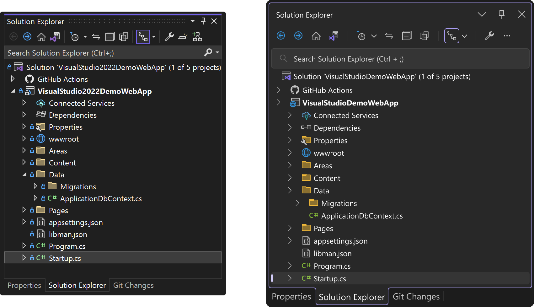
Another challenge we tackled was helping users locate the active area in a crowded IDE with many tool windows. We addressed this by using color and spacing more intentionally to cut down on visual noise. This approach ensures the active parts of the UI stand out, making them easier to recognize. The examples above illustrate these improvements to document tabs and tool window chrome.
As always with the DevDiv team, feedback from the developer community played a central role throughout the process, helping refine spacing, theming, and control sizing throughout the refresh.
Learn more about the process in the team’s blog posts: